When i approached the making of the digi pack my aim was to incorporate the design that was used in the actual albumn the song is from, which is "Whatever you say I am thats what i'm not", the cover and back and also inlay images were all black and white, which i thought made it look that much mroe grittier, also the simplicity of some of the images i also liked, for instance the front cover, also i then looekd at some of the single covers that were from that albumn also, from these i got the idea oif the white strips that run along the cover of my digi pack were the writing is liek what is shown below. I did'nt want to make a whole new product, i just wanted to make one that would fit in with the others, but also something that i oculd call my own, and out my own little tweaks on things.. Therefore after shooting some of the scenes to go along with the music video i took out a camera and also took some pictures, i used several angles and also i tried some different techniques to make the image different. Most of the work that was hardest was infact altering the images to be how i wanted them to be.
At first i played with the images using different effects on Photoshop, one i had which was infact a contender for being my front cover was one that i had put a red glow on, which did incorporate the title of the track, ( red lights), but i decided against this, my favorite was the simplicity that was itself used upon the original albumn cover which is to turn the image black and white, this gave the image a grittier and also perhaps a nostalgic or bleak look to it due to its lack of colour. I did have some initial problems with making some of the images i had taken fit into the scale of the cover. After gettting my images i then had to decide upon the font i wished to use, i used Festus, from dafont.com which is a gritty lookign font adn i played around with it, making some letters lowers case and some capital, i think it looks much more interesting that way. i then used the inspiration of the strip form the albumn cover to make it stand out, balck on white. On the images on the back i used the same font for the names of the tracks, i took time in choosing the tracks that i put on it, i looked at what the tracks were about and how they would effect the digipack and i cam up with the idea for it to almost be a narrative itself, all the tracks are about goung out or causing mischief the first two, "Put your dukes up john" and "Dancing shoes" are about gettting ready for a night out and also for dancing in a club etc, and i thought this was a clever way for them to fit togeather, also many of the tracks on the back have not been released properly are on the internet as free downloads so therefore i thought it was an interesting was to put them all togeather.
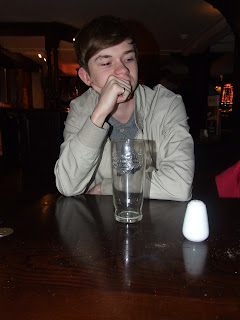
The three inside images i used i didnt really do much to, the first two i simply put some text on them as i thought the images themselves had enough attitude and could hold thier own without any special effects on them also the lighting on them was really good, the third i foudn a really interesting efffect on Photoshop called NEED TO FIND OUT which made the images look liek it was drawn or was a negative of a photo adn i really liked it, after this i then found the lyrics in the song that did actually say red lights indicates doors are secure and put it on there in a bold whit font, i thought this was a very good interesting image. The CD image itself i left much liek the other tow inside images just plain, but it was an exciting and energetic image, which was why i chose it, and also liek the other two it had attitude and a sense of laddishness about it whcih was after all what i wanted to capture both with the digi pack and video.
Here are my images before and after:
Here is one of the prototype images i had with a red glow on it reflecting the title of the song but i didnt use it in the end:


No comments:
Post a Comment